CASE STUDY — 2025
Triple P
A digital resilience programme helping parents and children navigate and respond to bullying.
- Year
- 2025
- Timeframe
- 1 year
- Category
- UX/UI Design, Design System
- Tools
- Figma, Miro, FigJam, Emotion Journey Mapping, Octalysis Framework, Zeroheight
↳ The problem
“The programme needed to translate evidence-based parenting and resilience strategies into an experience that felt approachable for both parents and children. Complex content, long-form activities, and multiple user journeys risked creating cognitive overload. At the same time, children needed an experience that felt engaging rather than instructional, and parents needed to feel that they and their child were benefiting from the programme.”
Overview
Triple P - Resilience is a digital programme designed to support parents and children aged 6–12 when dealing with bullying.
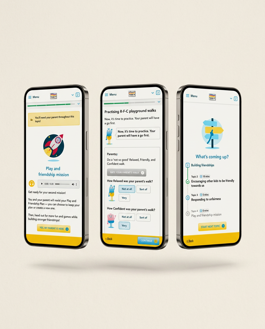
I shaped the UX across the programme, creating a clearer, more engaging journey that makes complex emotional and behavioural concepts easier for children and parents to understand and act on.


Solution
I redesigned the experience around clear journeys, age-appropriate interactions, and progressive learning, adapting the programme for two distinct audiences. The Child experience translated the characters, stories, and activities from the physical booklet into an engaging digital format, while the Parent experience took a more strategic and theoretical approach, giving parents the knowledge and tools to support their child.
Activities, feedback, and visual cues helped children build confidence by practising how to respond to difficult situations. I also developed reusable UI patterns and design-system components to create consistency across the programme.

